

I'm a stash builder, and I don't make large quilts, so my fabric choices are probably different from a lot of quilters. I've always thought that the way someone picks fabrics tells a lot about who they are, how they think, and what kinds of quilts they make.
Why one fabric and not another?
Like most quilters I don't have an unlimited fabric budget. I used to think it was a hindrance, but now I see it as an advantage. Because I can't afford to buy everything I need to be more selective. It hasn't kept me from acquiring a LOT of fabric, (it's been 46 years so I have that excuse), but I think I've gotten fabric selection down to an art form that works for me. I can think of very few fabrics I left behind at the quilt shop that I miss. I can, however, look at my stash and wonder, "Why in the heck did I buy THAT?"
I haven't bought entire lines of any designer's fabrics, (although I did come close with Kaffe Fassett about 10 years ago...). I tend to pick and choose, and frankly, I'm pretty choosy.
I'd be interested to find out how you make your selections so I hope you don't mind my showing you how I decide how I make mine.
First of all, it's important to be really honest with yourself about how you create quilts. In my case I work small so large quantities of fabric aren't necessary for me to have fun. Generally, I tend to buy half yards of most fabrics, quarter yards or fat quarters of others, and very rarely a yard or more of anything. If you're the kind of quilter who loves to make quilt patterns from magazines or books, many of which require coordinating fabrics, your needs will be different. Sometimes it can pay off for you to be a little flexible. I worked as an Assistant Manager at House of Fabrics years ago and often worked with quilters who couldn't find enough of their chosen fabric line to make the quilt they wanted to make. I loved working with them to find other fabrics outside their comfort zone, that worked beautifully with the fabric line they'd chosen. I always tell quilters that if they are uncertain, buy a small piece and try it out. When I was taking art classes one of my professors said that you should leave the piece you're working on somewhere in your house or studio so you can come upon it and view it with an open mind. It really helps to see what's working and what isn't.
If you have a stash it's important to keep it in mind. Why spend money on something new when you have something already. I always "shop my stash" first. Since my style is scrappy, I like to buy fabrics that will work with what I already have. Pretty easy when you have my stash! I'm also very picky about color. I made a mistake years ago with dusty blues and pinks, (80s...yuck!), I also have a small selection of neons, (what was it about the 80s anyway?). I did dump the dusty stuff but am still hanging on to the neons . . . go figure!
Anyway, colors matter to me. I love bright and vivid colors, but nothing too garish. Reds with too much orange or purple turn me off, I love a good antique or turkey red. I also struggle with chartreuse which tends to clash with everything. If I'm not sure what color predominates in a print I do the old "read" test. I pull a yard off the bolt and drape it. Then I turn my back, look at something else, and then turn around and look at the hanging fabric. Nine times out of ten I can see the dominant color right away. If I can't, I don't buy the fabric.
I tend to buy a wide variety of styles. Modern patterns with multiple colors are an easy choice because I love to mix them with florals and novelty prints. I am also a polka dot girl, but not so big on checks and stripes. I recently splurged on a couple of Hexy prints from Tula Pink's True Colors line. These choices will give you a good idea of how I roll:
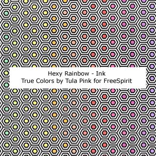

There are many wonderful colorful combinations of the Hexy design. For me it came down to what were the patterns I was most likely to use, either separately or together. Ink and Shell made the most sense. They both have a light background but the lines are dark in one and lighter in the other. I guess you'd call them the Yin and Yang of Hexy prints! I prefer a white background in patterns with a lot of "True Color" so these were a natural choice for me, a light and a dark to mix in with my stash fabrics. I also love hexagons! They are great because although they look modern and linear they go well with just about anything and add that little bit of structure you sometimes need when you use a lot of different fabrics. I can't wait to get my hands on these!
Tula is Terrific!
I happen to love Tula Pink's designs. She's so creative and talented. I think what I like the best is how distinctive her patterns are. Just a small piece of one of her designs improves any quilt. She is also terrific at choosing color combinations I love, so naturally, when she comes out with a new line I'm definitely interested.
This month her new line "Curiouser & Curiouser" will become available. As it's not unusual for her fabrics to sell out, it's worth taking a look to decide which prints you have to have. My favorite place to browse for fabrics is on the fabric manufacturer's website. They have great information about designers, and the best photos of the fabrics.
FreeSpirit Fabrics is one of my favorites, you can check out Tula's new line here:
I love this new line! It's based on Alice in Wonderland, and is fun and beautiful. I'd love a piece of everything but as I said, the budget is limited so I have to be particular. So, I've decided to show you which ones I would buy and which ones I wouldn't and why.
My Selections

I have a real fondness for scattered flower prints. There's just something so retro, and yet so modern about them. I have a hard time resisting any prints with bright pink and orange. There just aren't a lot of them. So, when I come across one as cute and usable as Baby Buds I've got to get some.
The Big Buds print is a 108" backing. I don't usually buy backings but when I do I buy a quarter or a half yard to make binding. It's so great to have a piece of binding 108" long. I'd buy some of this for that purpose alone.

Down the Rabbit Hole is an example of something I love about Tula Pink's designs. She can turn objects and characters into classic looking damask style patterns. I also have that fondness for pink and orange together. I'd definitely buy at least a quarter yard of this one, probably a half...it's just too much fun!

Anytime a pattern is printed on top of polka dots I'm all in! Who can resist purple roses on an aqua background? Not me! I'd buy a yard of this.

I'm usually a warm color gal but there's something about this blue gem that I really like. The light blue background with the white dots and leaves gives it a delicate look. The bright blue, pink, yellow, purple and green accent it perfectly. This is something I have to have. Depending on the size of the print I might go as much as a yard, but it will probably be a half yard purchase.

OK, I usually don't get too excited about novelty prints, particularly ones that have objects lined up, (hard to cut and piece). However, I love this one. Somehow the colors are bright, yet subtle. How does Tula do that? This pattern would definitely make it into a quilt. I also love purple and aqua, (two of my selections are that combo!). This is at least a half yard purchase.
The Others
I like all of these prints but they just won't work for the kind of quilts I make. It's too bad I don't have an unlimited budget because I'd go for fat quarters of all of these, just because they're so pretty.

Alice is wonderful! I love her face and hair and bow, and the garland surrounding her. I also love the damask style pattern that Tula does so well. Unfortunately, I don't see using these in any of my quilts. However, the Wonder version would be fabulous made into curtains in a little girl's room. I didn't have a daughter but if I did she would probably be looking out of Alice curtains!

The Red Queen fabrics are really fun. I love that they're on a subtle polka dot background, and who doesn't love that wacko hairdo. It's like David Bowie meets Elizabeth Taylor! I am a little tempted because of the "Q." Years ago I had a co-worker who called me Q, as my name is Susan, and you know, Susie Q! However, I just don't see myself using either of these.

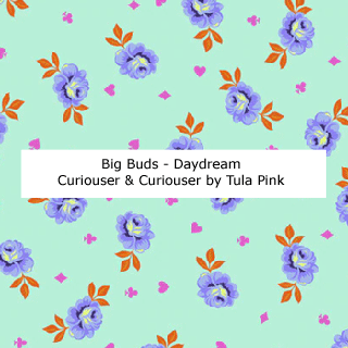
I do love these florals but the Daydream is too dark for me, and I have a ton of white background floral prints very similar to these.

Cheshire is cute, but I don't use many blue or yellow background prints. I'm on the fence about Somewhere, I like it, but I'd like to see if the background is more gray or purple. It's hard to tell from the photo.

These two colorways of Down the Rabbit Hole aren't anything I would use. Suited and Booted is actually kind of an interesting pattern with card suites instead of polka dots. However, they create a stripe and I don't use many of those.

I do love the Painted Roses prints. However, the Sugar is too light, and the Daydream is a red and pink dot and I already have several of those. I actually like the Daydream version of Suited and Booted better than the Sugar one. However, it's too much like a stripe for me to use.

Sea of Tears is an unusual pattern. The artwork is fabulous as usual, but the background is distracting.

Tea Time is so cute! I just can't use three of them so I picked the aqua background because it's my favorite.
So, it looks like I won't be spending too much on this line. However, if I were the kind of quilter who had the patience to follow a pattern, the Mad Hatter's Tea Party quilt below might send me down the rabbit hole. It is too cute!

Happy Stitching!
No comments:
Post a Comment